With over 50 years of experience in diverse artistic commissions, I have deeply explored design, composition, and color. This lifelong journey has cultivated profound insight, artistic integrity, and a refined sensibility—most notably in the mastery of color. Early in my career, designing color compositions for a national wallpaper manufacturer sparked an intense investigation into color harmony and the warm-cool dynamics of primary, secondary, and tertiary palettes. By applying the "3 C’s of Art"—Composition, Color, and Creativity—I unlocked endless nuances in my work. This foundation transformed a structural understanding of designer color coordination into a lifelong, penetrating exploration of color composition.
Second, everything crystallized while I was designing monumental stained-glass windows for national studios. There, I gained firsthand knowledge of the differences between the three primaries of pigment (RYB: red, yellow, blue) and the three primaries of light (RGB: red, green, blue). Pigment is subtractive, meaning that mixing colors together creates a progressively duller shade—such as combining yellow and blue to create green, which is a light primary. Conversely, light is additive. Mixing light colors together creates an ever-more intense hue; for instance, green and red light combine to create yellow, which is a pigment primary. Further, in pigments, yellow placed on a dark, purple ground is the most luminous color. However, in the light of stained glass, blue exhibits a phenomenon known as halation. Blue is so luminous; its light branches out, expanding beyond the black matrix of lead or the wide, black barrier of the epoxy resin structure in a Dalle-de-verre window, obscuring it in rich, beautiful blue light while yellow pales in comparison. Thus, in light, blue is the most luminous of all colors despite its rich darkness. This interplay represents one of the many profound natural mysteries of how life-generating color manifests.
Designing monumental, liturgical stained-glass windows provided me with an in-depth understanding of color theory, liturgical symbolism, and color psychology. My work utilizes specific color palettes to evoke distinct meanings and psychological responses. For example: red for passion, blue for spiritual depth and calm, and green for rebirth and psychological neutrality. Additionally, yellow represents knowledge and sharp intellect, purple designates royalty and nobility, and orange serves as a vibrant anchor for warmth, energy, and enthusiasm.
Third, after experiencing the immediate impact of RGB colored light filtering into the dark church interior, I was introduced to RGB on a computer screen."
In the 1980s, my parents warned me that I would eventually need to learn how to use computers. Back then, I resisted. As an artist who worked with paint, brushes, canvas, and glass, I couldn't understand why a computer would ever be necessary for my craft. However, by 1997, 20 years after graduating from The York Academy of Arts, I enrolled at Bradley Academy for the Visual Arts to bridge that exact gap. My dedication earned me an induction into the Alpha Beta Kappa National Honor Society. Through my education, I discovered that digital art is deeply rooted in tradition; the quality of what you create on a screen is only as good as your foundational skills in color, composition, and draftsmanship. Mastering a mouse or stylus requires immense physical dexterity—arguably more than a pencil or paintbrush—combined with a steep learning curve of technical knowledge.
Through many years of self-directed practice, one has mastered a wide range of digital skills, with a specialized focus on Adobe Photoshop. I now leverage its advanced, innovative toolset to create Fine Art Digital Paintings. Knowledge of html coding equips me to publish my own website.
As an 1977 fine art honors graduate from the York Academy of Arts, I have spent nearly 50 years mastering the intersection of light, color, and form. After majoring in painting, I entered the stained-glass field in 1979, eventually designing and producing monumental windows across the United States. While I still maintain a dedicated practice of sketching and traditional painting, my recent work explores the digital realm. Creating on a computer screen allows me to paint with RGB light—a process that perfectly mirrors the experience of designing scaled, transparent lumière stained glass. Ultimately, whether working with glass, canvas, or pixels, light remains the vital, driving force of my artistic creation.
|
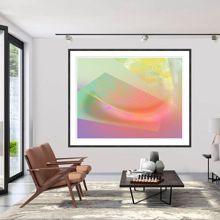
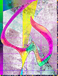
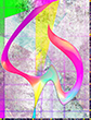
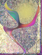
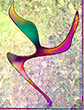
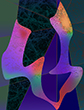
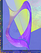
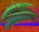
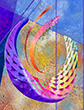
These works function as "Metaphysical Symbols" where form and color harmonize to evoke deep, heartfelt impressions of life. Central to these images is the concept of an inner radiating light emerging from within a counterpoint of shadow. In some pieces, this light radiates outward, nearly eclipsing the darkness; in others, it remains obscured within the shadows, virtually unseen. This light embodies the positive forces of human nature—growth, intellect, and transcendental love—while the darkness represents its shadow sides, such as anger and complacency. Ultimately, the collection explores an eternal paradox: darkness heightens the beauty of light, just as the presence of evil underscores the profound joy of benevolence.
|
Unlike mass-produced commercial reproductions of traditional paintings, often printed in runs of thousands or millions, digital giclée printed paintings by Curtis R Doll Jr. are genuine, computer-created original works of art. Each piece is a strictly limited edition of 75, accompanied by 5 artist proofs.
Once the final print of the 75-edition series is completed, titled, numbered, and authenticated with Curtis's official seal, the high-resolution .tif files are permanently deleted. Only compressed .jpg and production .psd files are kept for reference. His unique, official signature is printed on the painting.
Every artwork is painted at a full-scale image size of 21" x 16" (350 ppi) and optimized at 300 ppi for printing. Including the 1-inch white border for the edition number, title, and seal, the final dimensions measure 23" x 18" (or 18" x 23" for horizontal layouts-standard museum practice lists height before width). Every piece includes a Certificate of Authenticity.
Once again- Curtis’s digital creations are classified as paintings due to their exceptional individual craftsmanship and artistic complexity. Hand-drawn-painted using a computer mouse, each piece features a rich spectrum of colors, intricate linear and textural effects, sublime form, and subtle blending techniques that elevate them far beyond standard flat fine art prints. Masterfully commanding a mouse—a tool arguably more challenging than a traditional brush or pencil—Curtis combines innovative late-20th-early-21st-century Giclée painting and printing techniques with high technical expertise to push the boundaries of fine art.
Giclée (pronounced Zhee-clay) is a French term meaning to spray, which is how an inkjet printer works. However, giclée printer is much larger, more detailed, and capable of producing images a little over a meter wide with a maximum size of 58" x 70". Printed on high-quality archival papers, it is widely considered the best method for creating detailed, long-lasting limited editions of digital fine art and photography. [1] (Giclée-printing-vs-standard-inkjet-whats-the-difference?)
We print our work using only brand-name, special light-fast pigment inks across a 12-color spectrum to achieve the highest possible color saturation and subtle gradient variations. These archival-certified inks are paired with 100% acid-free archival rag paper, creating a museum-quality combination. When treated properly, these prints are designed to resist fading for lifetimes, allowing you to confidently hand them down from generation to generation.
Although Curt has been painting and drawing all his life, he has been a professional, working artist since 1977.
© 2026 CurtisGraphics All Rights Reserved
The Lark Ascending
video
On-line Awards
a love letter
The Lark Ascending
Out of abyss emerges the matrix
Primordial egg of existence
Diaphanous womb of our universe
Permeated by luminous power of celestial origin
Tempest is released from its fetters
Instantaneous collisions of energy thunderclap in silence
Pristine semina of duality take their stance
Origin of diversity begins
Mirror of endless contemplation crystallizes
As the chrysalis manifests itself
An entity of reflection,
Of spiritual longing takes form
Olamic metamorphosis impels cyclical inertia
Causation begins
Entrails of the nucleus expand and
Break apart releasing the monad
The lark ascends
An ecstatic paean issues forth
Venerating innocence with increasing charm
As resonance illumines Lydian Measures
The lark sojourns
Till elixirs of lengthening vigilance overflow
Then resumes its journey
Curt Doll
(After the Musical Composition
by Ralph Vaughan Williams)
Composed by Ralph Vaughan Williams in 1914 and orchestrated following the First World War in 1920, The Lark Ascending is a pastoral romance for solo violin inspired by George Meredith’s poem. While it is widely celebrated as an evocative portrait of pre-war English countryside, listening to it alongside the deeper spiritual undertones of his symphonic works suggests something more intimate. To me, the soaring violin does not just mirror a bird or a lost era; along with the substance of the composition, it captures a profound spiritual yearning to discover one's own inner being.
For five decades, both the poem and its visual compositions have undergone continuous revision. A recent and only addition to the text introduces the phrase "in silence" immediately following the line, Instantaneous collisions of energy thunderclap. While the musical score lacks a crescendo powerful enough to mirror a literal thunderclap, this omission actually deepens the poem's emotional weight. Ultimately, the juxtaposition introduces a compelling sense of mystery—a "happy accident" I first discovered at The York Academy of Art and one that continues to bring me immense joy to this day.
As an 1977 Fine Art graduate of the York Academy of Arts, I have spent my life immersed in classical music, ballet, art, and literature. This project, inspired by Ralph Vaughan Williams’ sublime violin composition, The Lark Ascending, seeks to reveal the profound interconnectedness between music, poetry, and visual art. By pairing evocative imagery with the poem, I invite you to experience them simultaneously while listening to the music. Through this multimedia harmony, the final line of the poem silently evokes the grace of ballet.
In 2002, the poem "The Lark Ascending" was published in the International Library of Poetry anthology, The Solace of Night (Watermark Press, Owings Mills, MD 21117).
|
|
The Art Academy of Paris, in partnership with artcult.com,
has voted to honour this site with its award of excellency.
All images on these pages are copyrighted
© 2026 CurtisGraphics all rights reserved.
TOP |
| |